AC Sparta Prague
When creating the visual style and the logo itself, the intention was to preserve the key elements that have defined Sparta for almost 130 years, thus creating a clear and distinctive brand that builds on the club’s unique history. To some extent, this is a facelift of the existing brand, which we have greatly simplified and cleaned up.
A completely new feat is the unification of all club entities under one visual system and the setting of a visual communication style. In it, we bet mainly on distinctive typography and the use of Sparta’s colours.
Football Sparta is the biggest sports brand in the Czech Republic in terms of fame and number of fans. The Go4Gold team worked on changing its logo for more than a year. A lot of attention was paid to the presentation and communication of the logo.
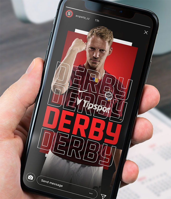
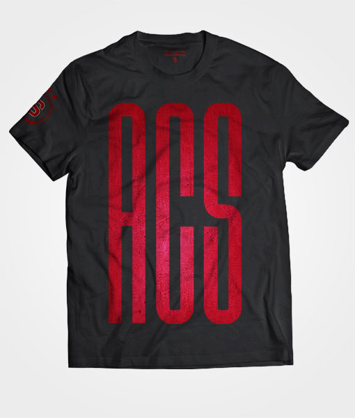
Visual style
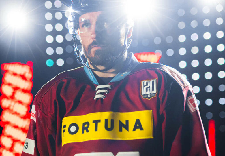
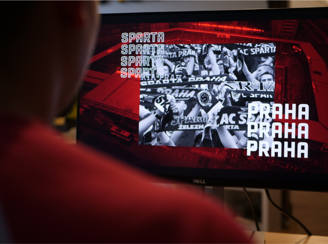
Along with the new logo, a brand-new visual style was introduced. It features a black colour, referring to the first Sparta jerseys, and a contrasting crimson-red gradient.
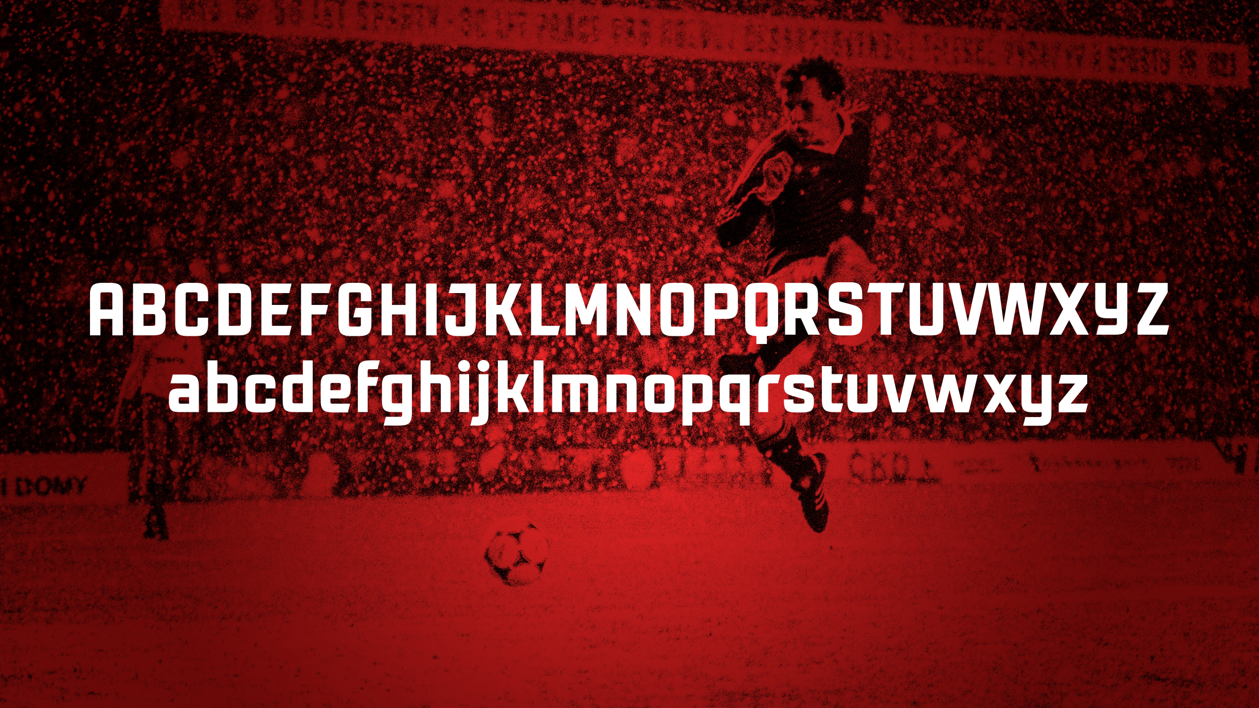
New font Železná
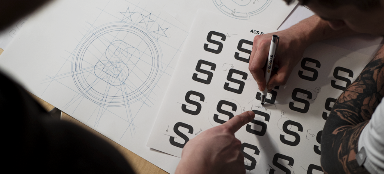
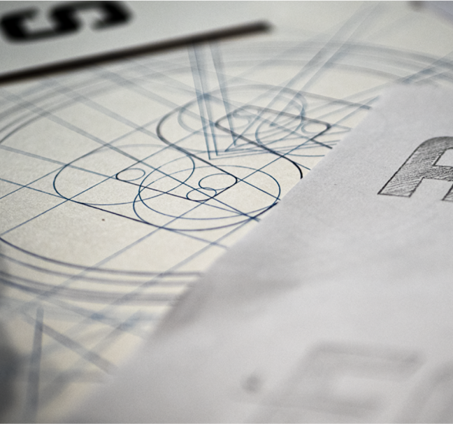
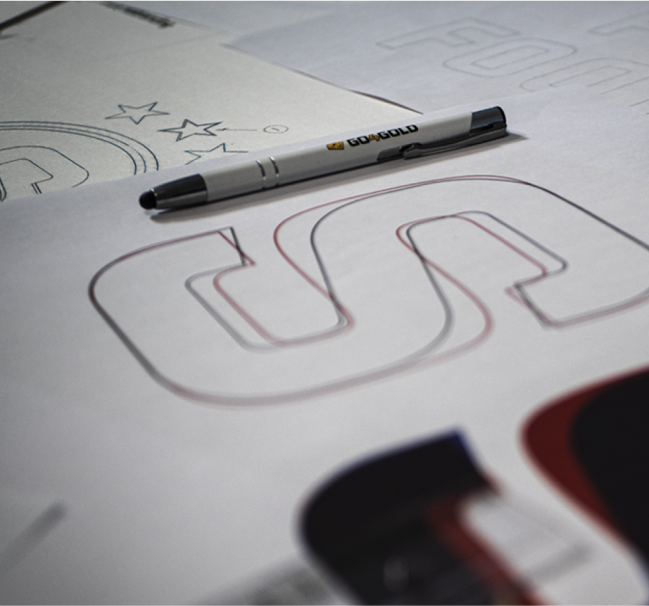
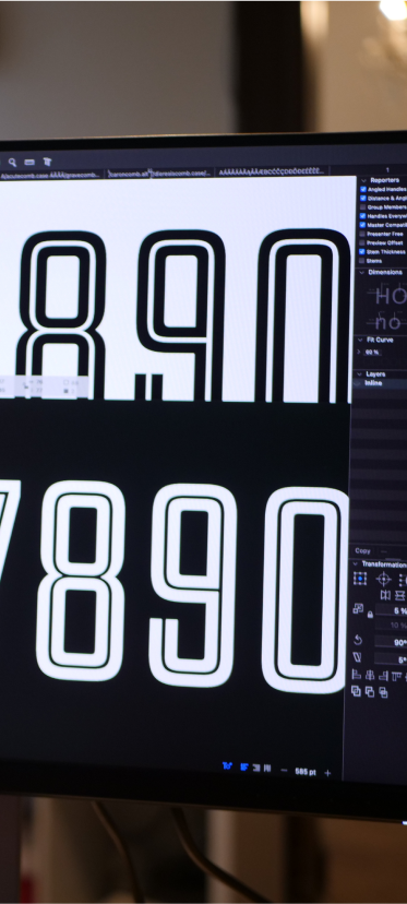
Sparta became the first club in the Czech Republic to use its own custom-made font. The font Železná is based on the drawing of the eS symbol in the new Sparta logo.
In addition to the classic set of characters, a special set of numbers and letters was created especially adapted for the jerseys of Sparta football players. The author of the font is Šimon Matějka.
System of visual elements
The rebranding did not only change Sparta’s logo, but it was necessary to create a coherent system of all secondary logos of the entire organization so that the whole would look visually consistent.


Although changing the logo of a sports club of such importance is always very emotional for its fans, the new identity was almost immediately accepted with respect. After a few months, few doubted its positive effect.
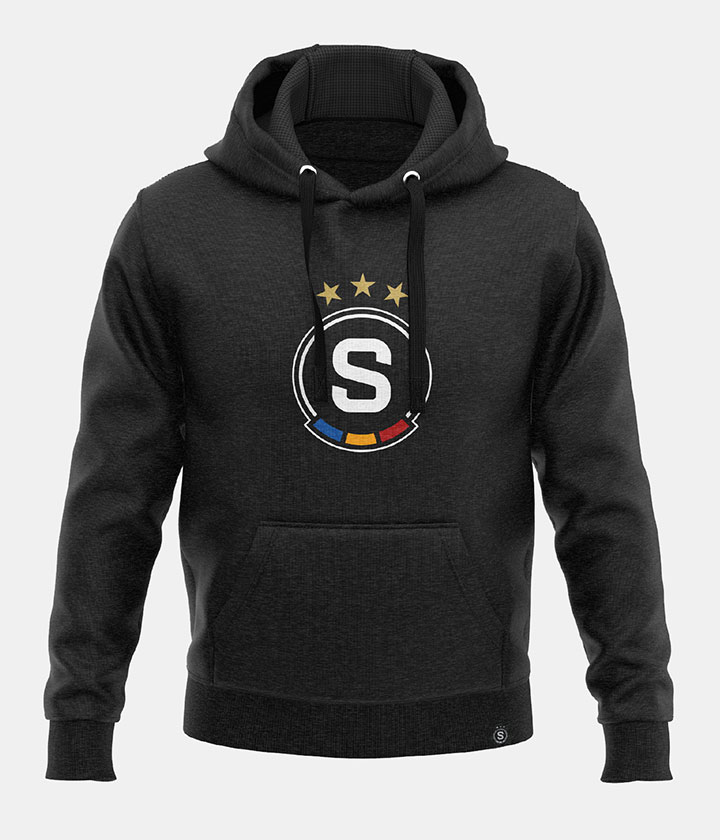
The first jerseys with the new logo sold out immediately and the fan shop sales on the day of the launch of the first collection with the new logo were record-breaking. Total sales for the first season were double the previous year.
Silver Effie
The rebranding project won the 2021 Marketing Effie Award

 Web of the project